.
Okay, so reading a lot of UK based blogs, it seems we're all struggling to take decent photographs because of the grey murk we call our weather.
.
So now I'm going to let some of you into a little secret ....
.
There's a whizzy website called Picnik - I'm sure most of you have seen it popping up on flickr, but maybe you've never got round to having a play with it?
.
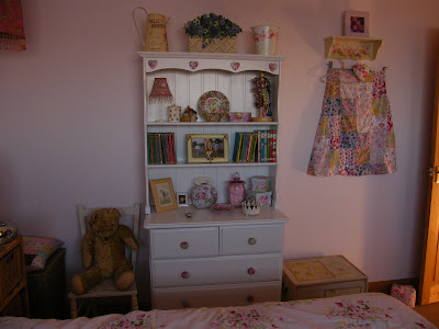
Here's a photograph I took the other day for my blog post about my bedroom.
.
 .
.
It's okay I suppose, you can make out everything, but it's a bit gloomy and it would have looked great if I'd taken it on a nice, sunny day.
.
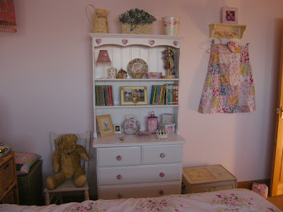
So here's what I've done with it in Picnik - I've increased the exposure and taken down the temperature :
.
.jpg) .
.
Now I would say the above photo has pretty much true-to-life colours
(although it does kind of depend on your monitor of course)
.
Here is a picture of one of my PE bags, taken next to a window on a background of white card.
.
 .
.
In the photo above it looks like I've used fluorescent, day-glo red felt and the card looks quite blue.
.
In the photo below, I've experimented with the saturation and exposure and now the card looks pretty close to white and the red is a much more natural and less scary colour.
.
.jpg) .
.
Once you've familiarised yourself with all the buttons and gizmos, you can really play with your photos!
.
 .
.
 .
.
So now I'm going to let some of you into a little secret ....
.
There's a whizzy website called Picnik - I'm sure most of you have seen it popping up on flickr, but maybe you've never got round to having a play with it?
.
Here's a photograph I took the other day for my blog post about my bedroom.
.
 .
.It's okay I suppose, you can make out everything, but it's a bit gloomy and it would have looked great if I'd taken it on a nice, sunny day.
.
So here's what I've done with it in Picnik - I've increased the exposure and taken down the temperature :
.
.jpg) .
.Now I would say the above photo has pretty much true-to-life colours
(although it does kind of depend on your monitor of course)
.
Here is a picture of one of my PE bags, taken next to a window on a background of white card.
.
 .
.In the photo above it looks like I've used fluorescent, day-glo red felt and the card looks quite blue.
.
In the photo below, I've experimented with the saturation and exposure and now the card looks pretty close to white and the red is a much more natural and less scary colour.
.
.jpg) .
.Once you've familiarised yourself with all the buttons and gizmos, you can really play with your photos!
.
 .
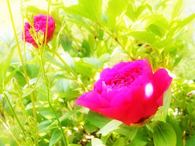
.Here I've used The "Orton-Ish" feature and applied it to a photo I took in the summer of a peony in the garden.
.
.
 .
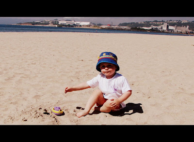
.On this one I've used one of my favourite features, "Cinemascope" - use with or without the letterbox effect
.
.
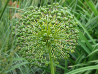
This is a photo I took of a Giant Allium plant - I've used the "Focal Soften" tool to make the plant in focus and the background soft.
Have fun with your photos!



6 comments:
Wow, I have got to go and play with that!! It's just having the time isn't it!! I really envy people that can take good piccies, I have a good camera...if only I knew what all the buttons did!! x
Is picnik any different to Windows picture editor?
(I am one of those people..see my latest blog post)
wow.. lady that sounds GREAT will have to not workout .. and try it out..
I have an award for you. You can pick it up on my blog if you'd like. :)
there is an award for you on my blog =)
rachel
x
What a great idea! Thank you for sharing your secret. I love how the photos look. Sorry if this comment appears twice, but my computer is acting up and I don't think it "took" the first time. :o)
Post a Comment